Shipping an engaging responsive website to help drive more web-based sales.
Client
GreytHR
Studio
Uncommon
DURATION
4 months
Team Members
- Dhruv Saxena
- Ridhi Brahmwar
ROLE
- UX Designer
- Visual Design Lead
SKILLS
- UX Analysis
- Wire framing
- Prototyping
- Illustration
ABOUT THE PROJECT
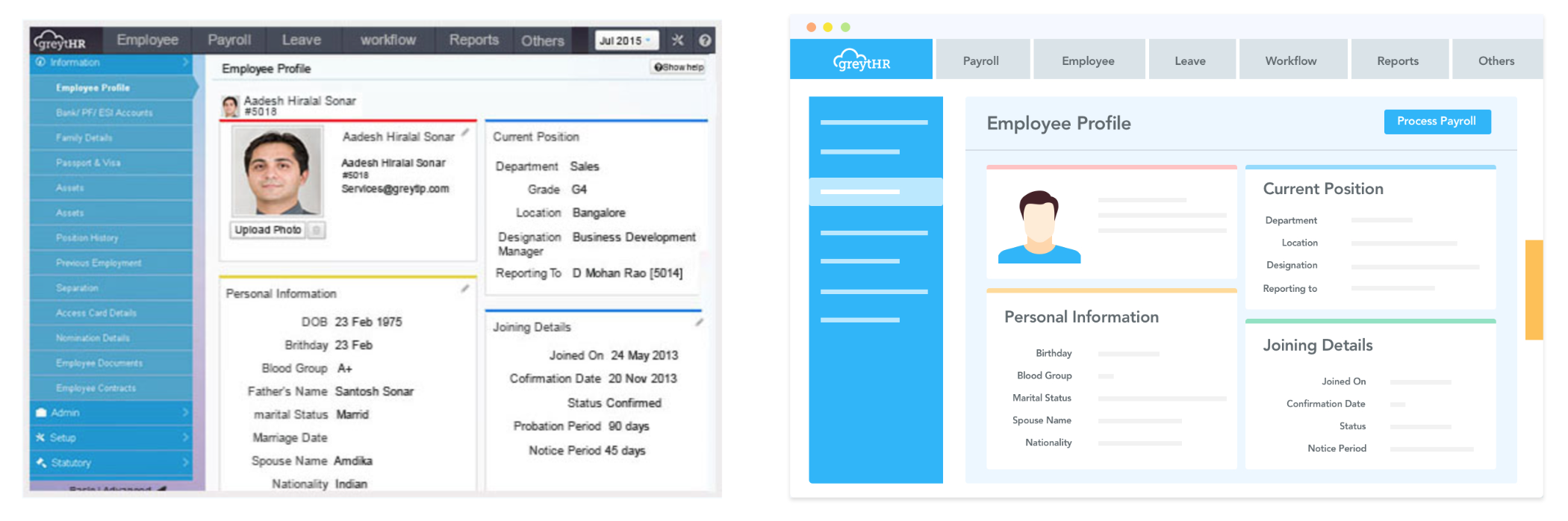
GreytHR is India’s leading HR and Payroll software company targeted specifically towards small and medium sized enterprises. This project was for the revamp of the customer facing website NOT the software itself.
OUR SOLUTION
SEE THE LIVE WEBSITE WE DESIGNED.
WHY GREYTHR NEEDED US
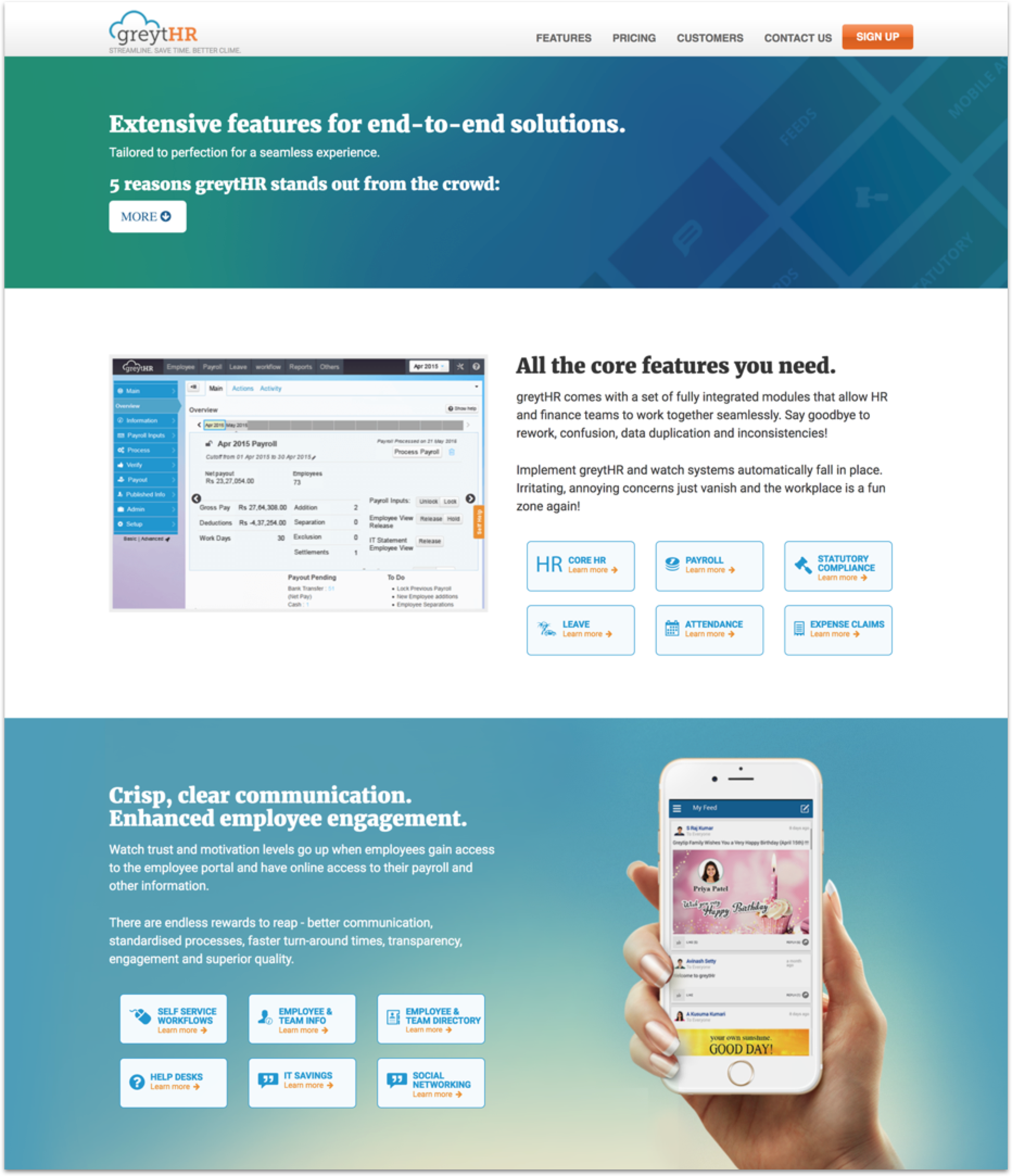
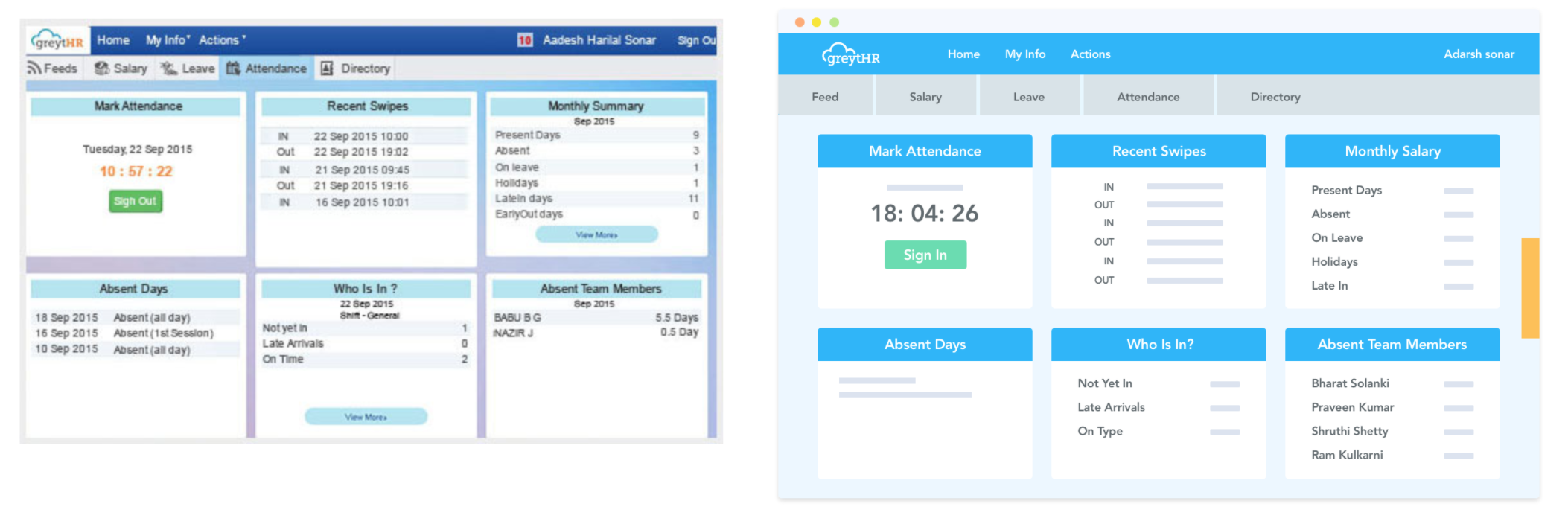
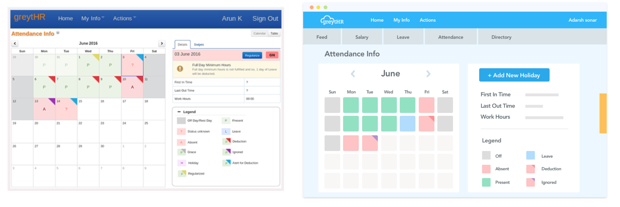
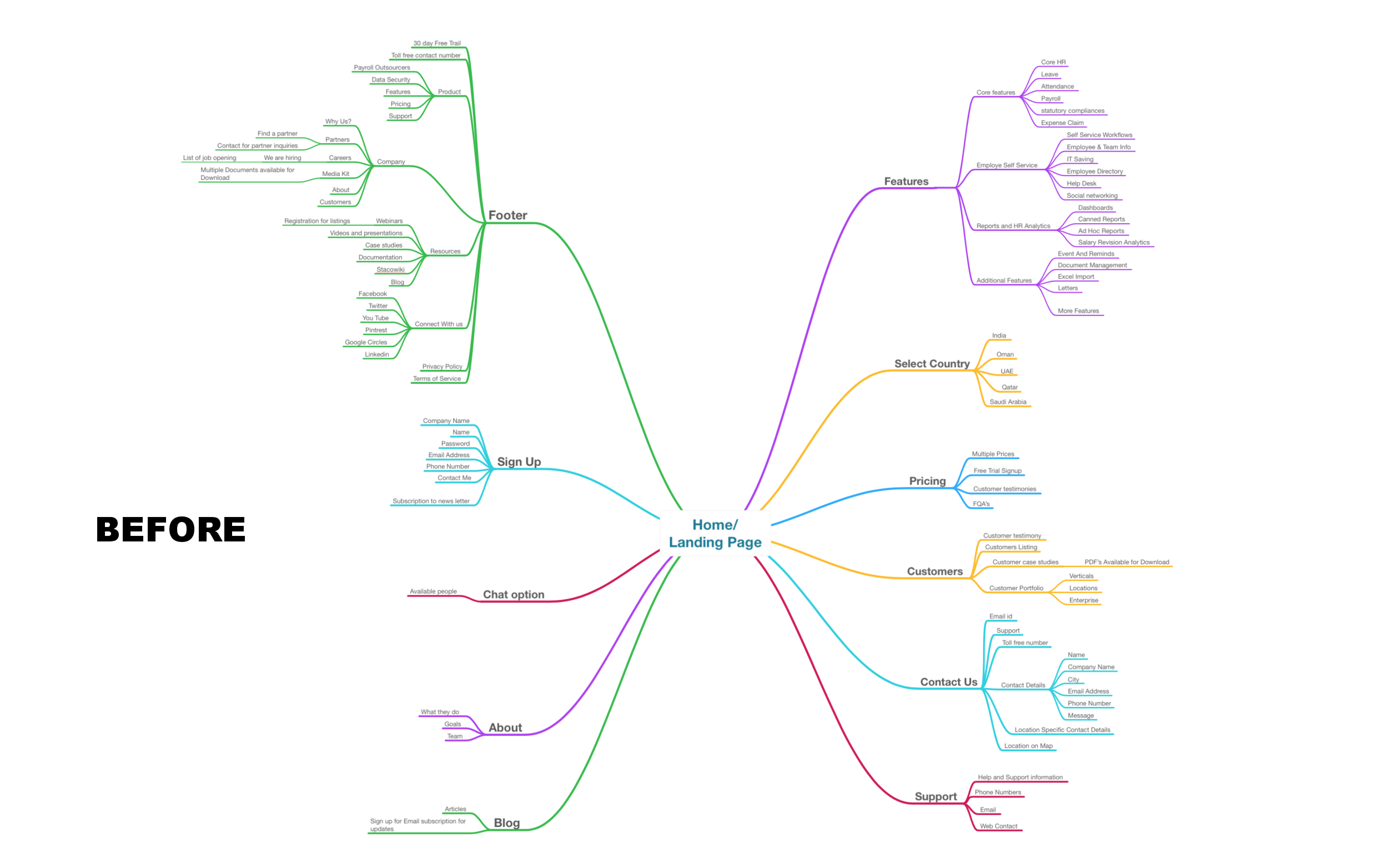
GreytHR’s website had not been updated for decades was no longer being helpful in driving sales. Shown below is the Homepage for the website BEFORE GreytHR came to Studio Uncommon.
Not only was the website visually very dated, it also had a very complicated and complex site navigation, as shown below.
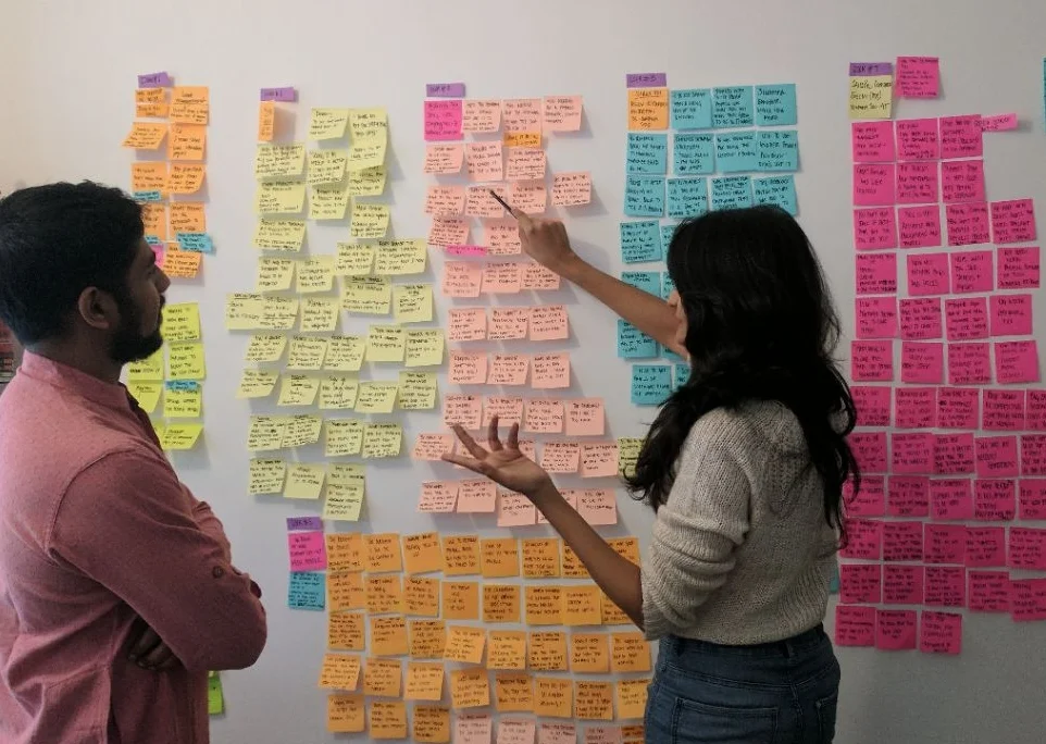
IDENTIFICATION METHODS
We started the entire process by doing a UX analysis of the old website to identify what exactly was going wrong and these were the methods we followed.

GreytHR customer Interviews
We conducted interviews with existing GreytHR customer to understand their journey and experience using the website.
FLY-on-THE WALL SUPPORT CALLS
We shadowed a lot of their support calls to understand how GreytHR support handles customer problems and what are the most common problems that customers come to them with.
Data ANalysis
We also analysed their mix panel data to get quantitative insights to some of the most common problems on the website.
PRoblems Identified

Word of mouth
GreytHR had started relying heavily on the word of mouth for promoting their software
LOW CONVERSION RATE FROM WEBsITE
73% of the people who browsed the wesbite dropped off without any purchase or signup for free trial. They had extremely low conversion rate from their website.
LOW SIGN-UP for free trial
A whooping 90% of the people dropped off at the sign up form.
MISSION STATEMENT
So after the identification of the problems, this became the mission statement for our project
Create an engaging & easy to browse website to help improve GreytHR’s conversion rate.
GOALS FOR NEW WEBSITE
With that mission statement in mind, these were the goals we identified for the website.
MAIN GOAL
Flatten the website, which means reduce the site hierarchy and make the site easy to browse
SUB GOALS
- Simply the Features page and make the product features easy to find
- Help customers self solve problem and not feel dependent on the support page
- Improve experience for the sign up page.
- Make the entire website aesthetic and pleasing.
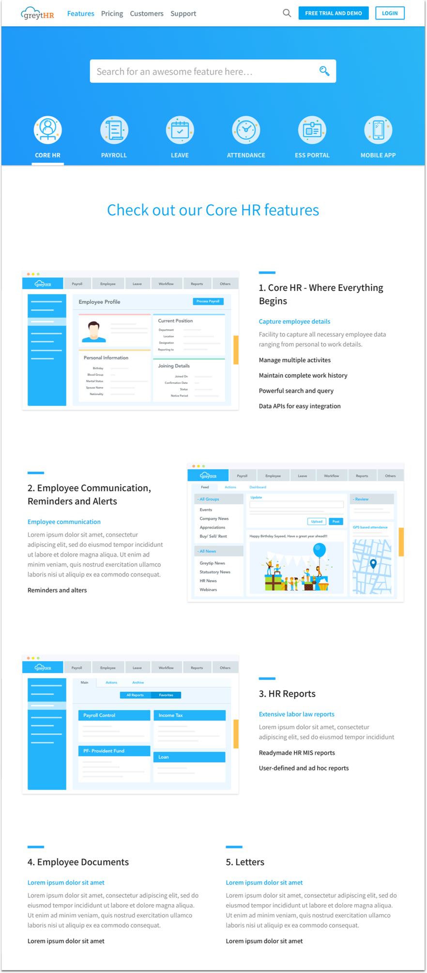
DESIGNING THE WIREFRAMES
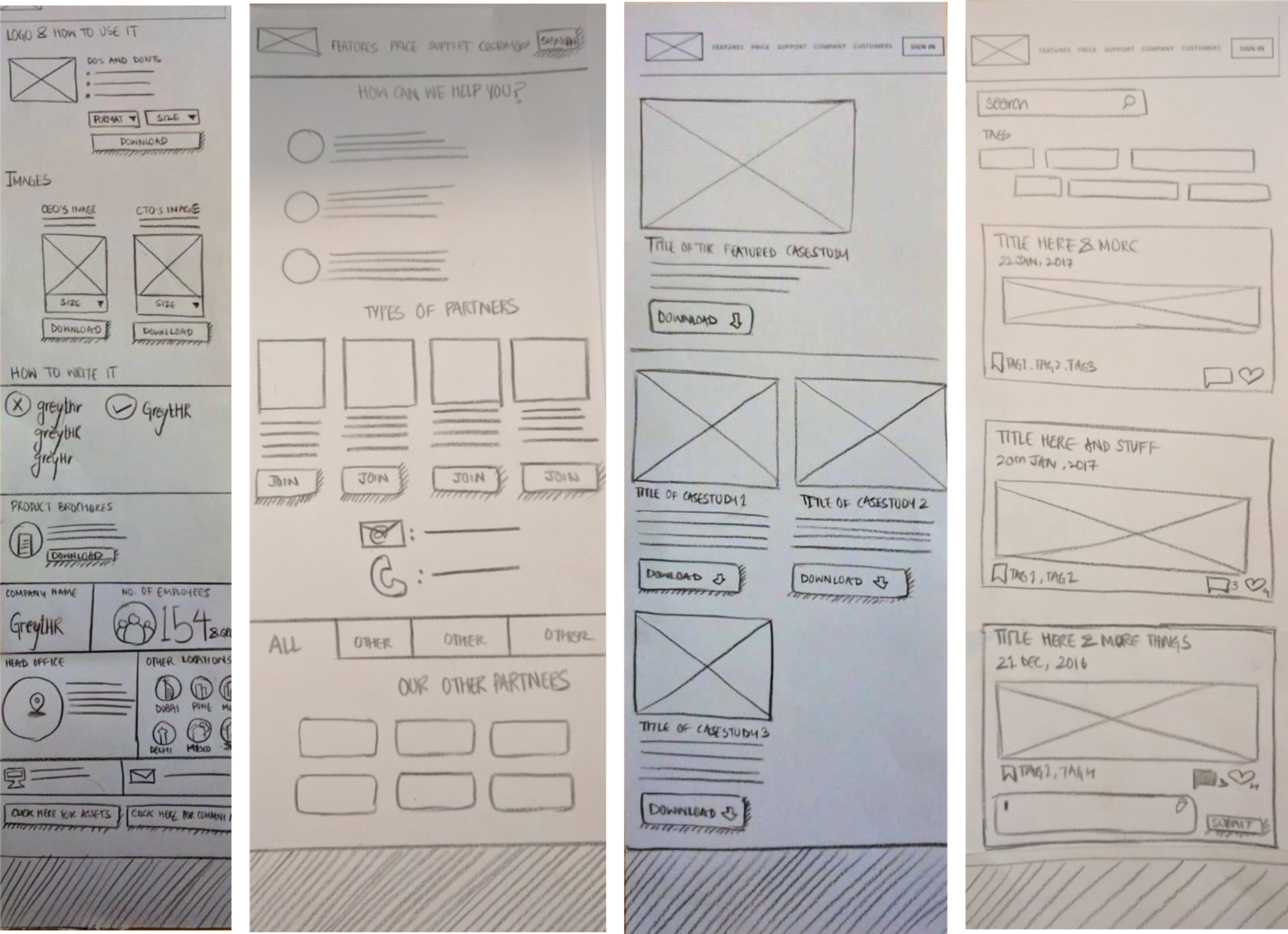
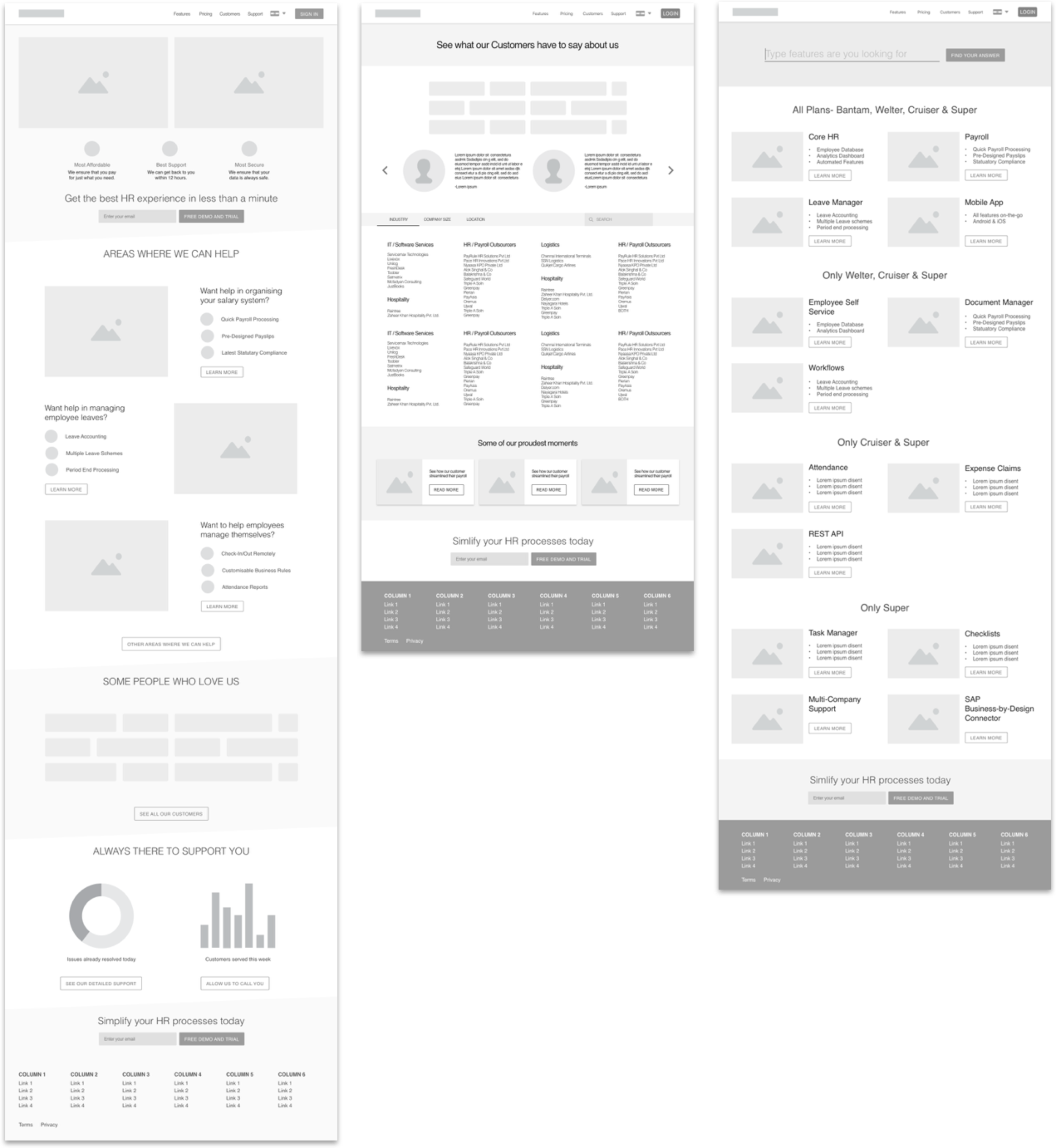
HOW INSIGHTS INFORMED FINAL DESIGN
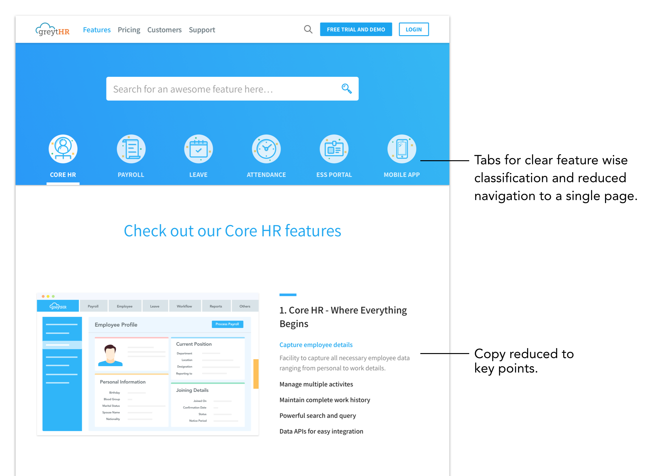
INSIGHT 1 - Features were hidden under complex navigations.
Shown below is the old features page with unclear and complex navigation.
As shown in the site hierarchy in the very beginning, if a user came in to navigate on the website, they couldn't reach what they wanted fast enough. So we created lots of alternate versions for the feature page, experimenting with all kinds of best practices in layout and UI.
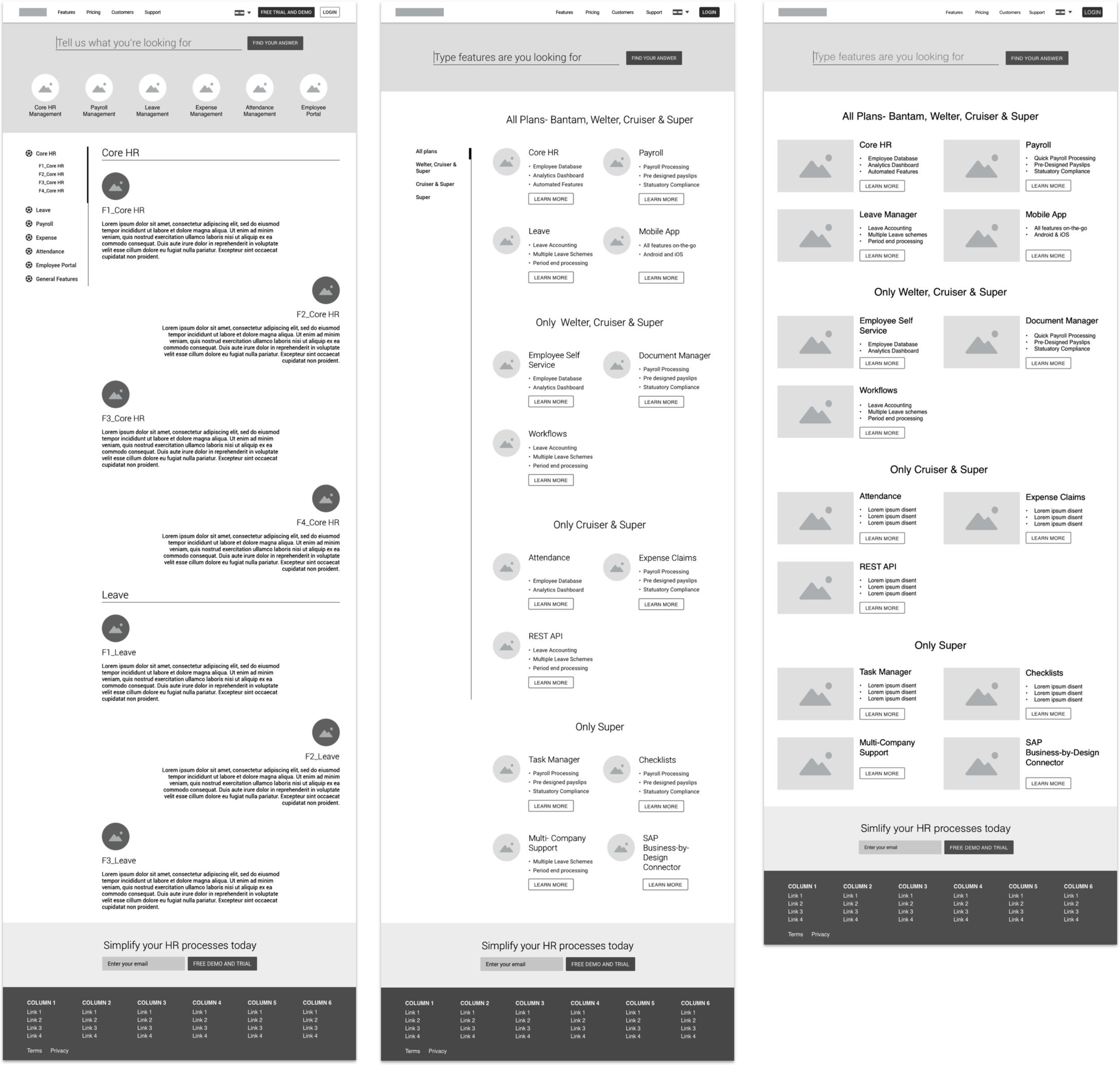
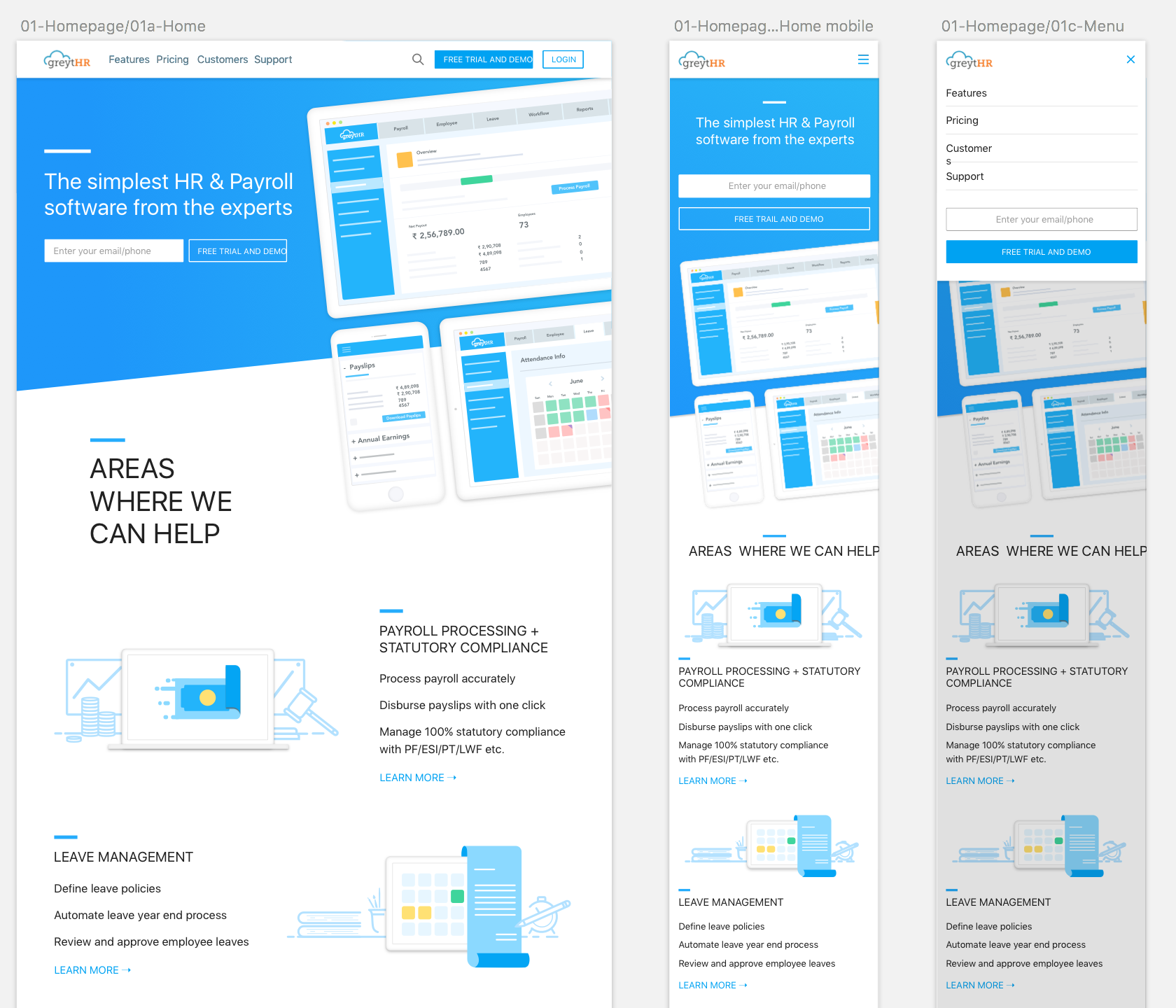
FINAL DESIGN- FIND FEATURES EASILY
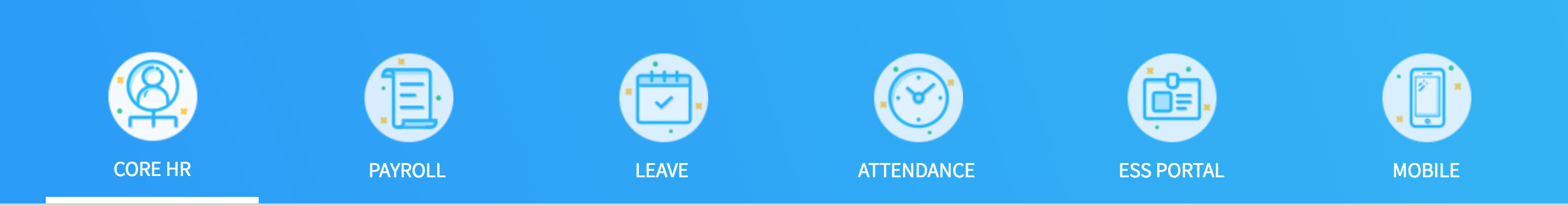
It occurred to me that the problem could be solved with a change in the layout, We went for a tab structure so that all the 6 core features could now rest at the same level in terms of information hierarchy, it brought all the features to a single page and made it very easy to swap between them to see the features nested under them.
See the live features page here
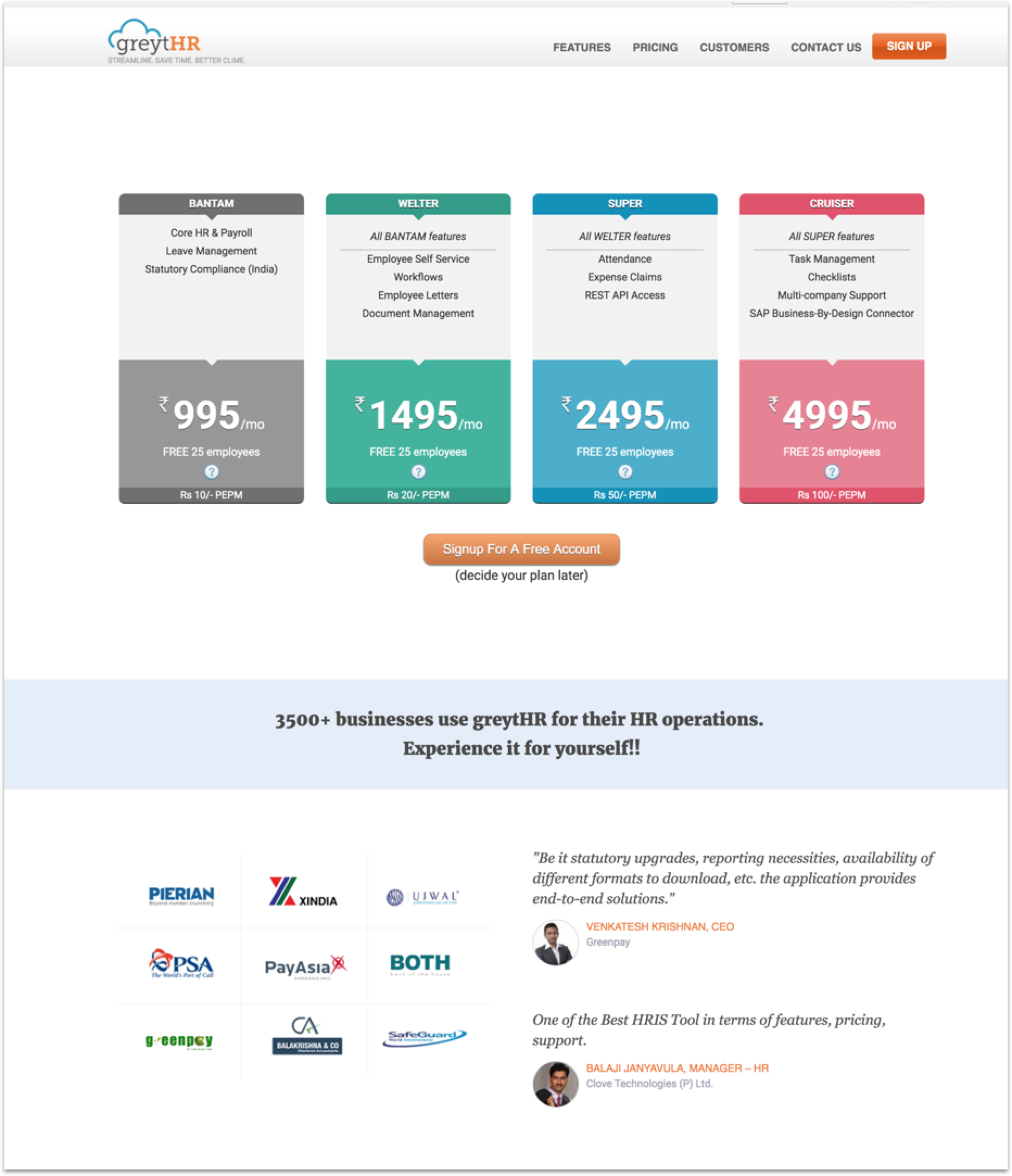
INSIGHT 2 - Pricing plans were not easy to understand
In the old Pricing page, the user could very easily see what the price difference between the plans was but they couldn't easily see what features they were getting in one pack vs. the other. This made them very hard to compare and thus made it hard to understand which plan was best for them.
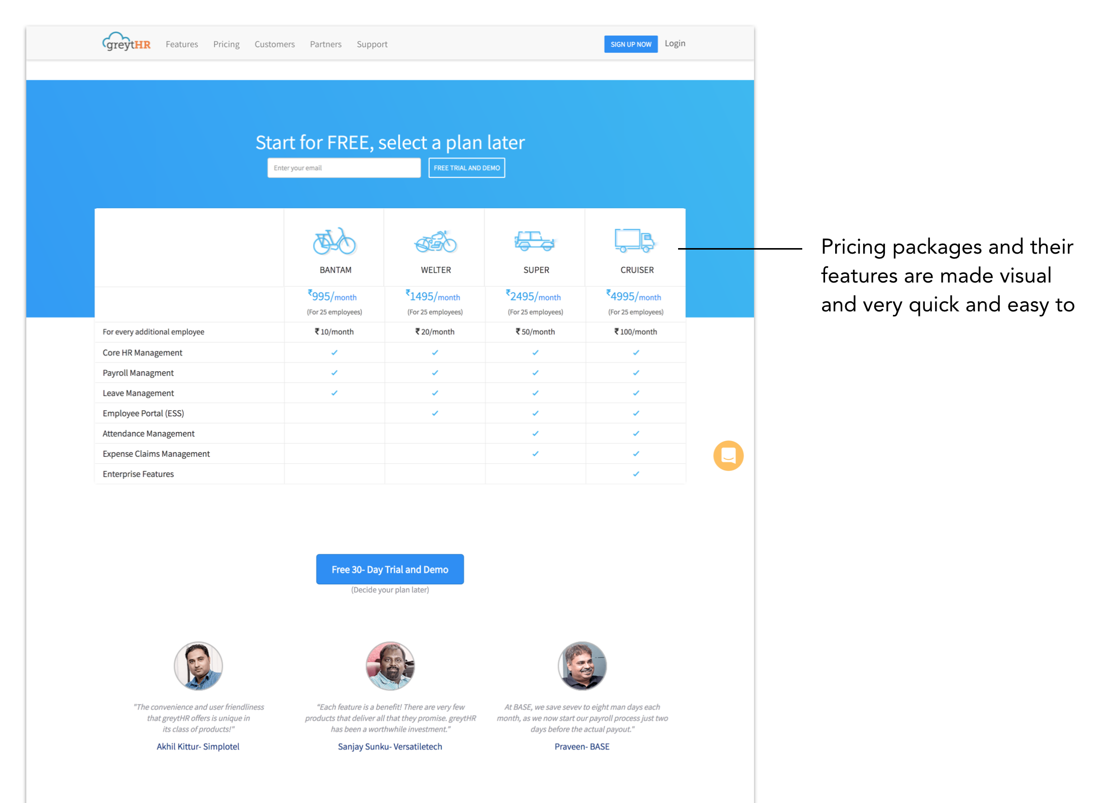
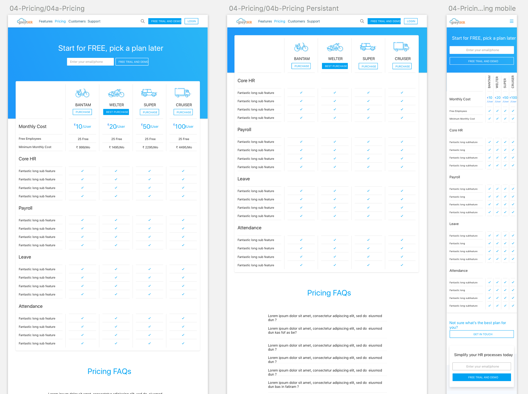
FINAL DESIGN- CLEAR VISUAL PRICING PLAN
I created a very visual way of representing the pricing plans, using a visual metaphors like a cycle for a light plan and a pick up truck for the most robust plan. Moreover, the blue ticks make it very easy to spot which features are easily carried forward in the next plan.
Live pricing page
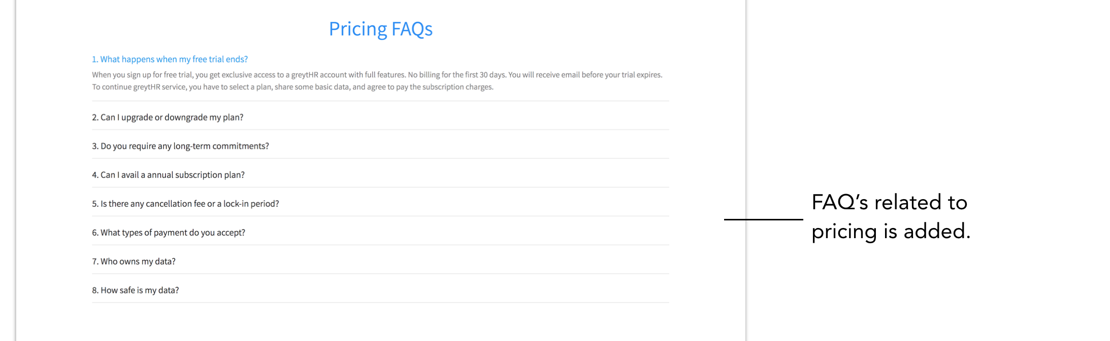
We also added FAQ's related to pricing to iron out any doubts that customers might have at this point.
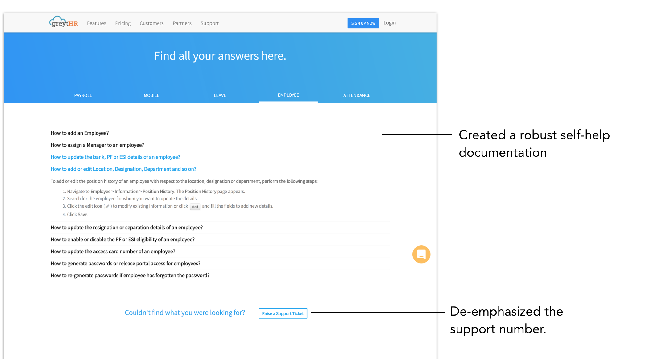
INSIGHT 3 - Support was not efficient.
This was a two fold problem:
- Customers loved the GreytHR support but even for solving the smallest problem, the old support page prompted people to call the support center. So they felt like they were dependent on it.
- On the other hand, the support center employees received the same questions over and over again
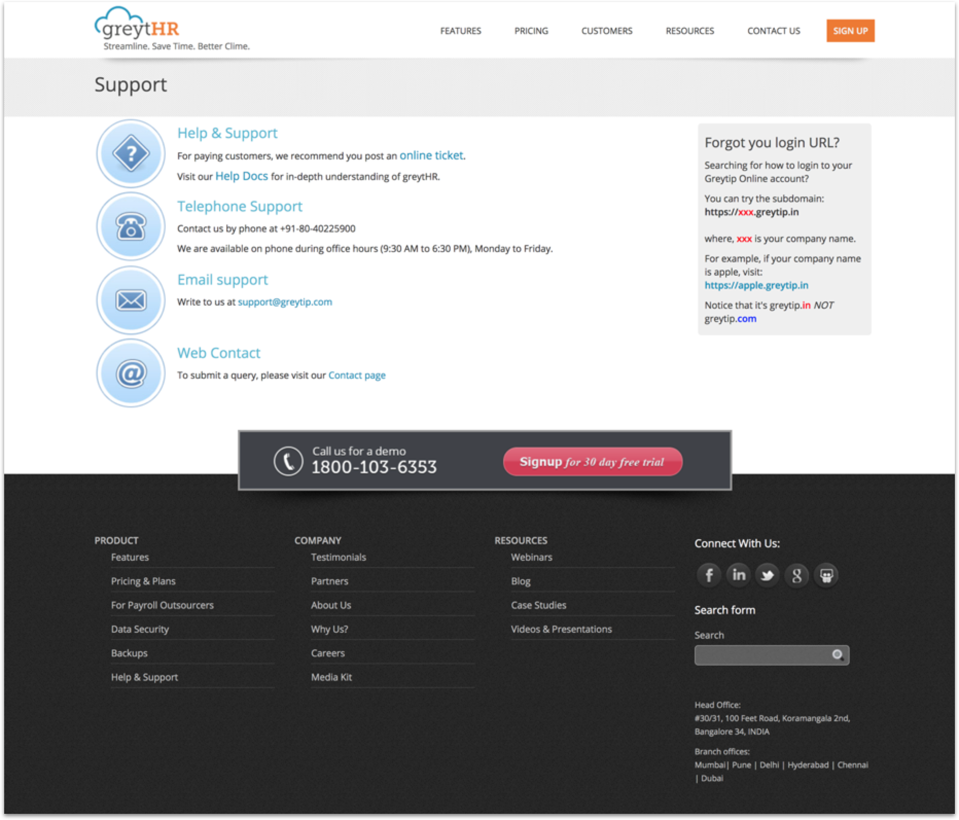
FINAL DESIGN- Robust Documentation for suppORT
This not only made the customers feel like they could now solve problems faster and on their own but also took away the burden from their support center employees.
Live support page
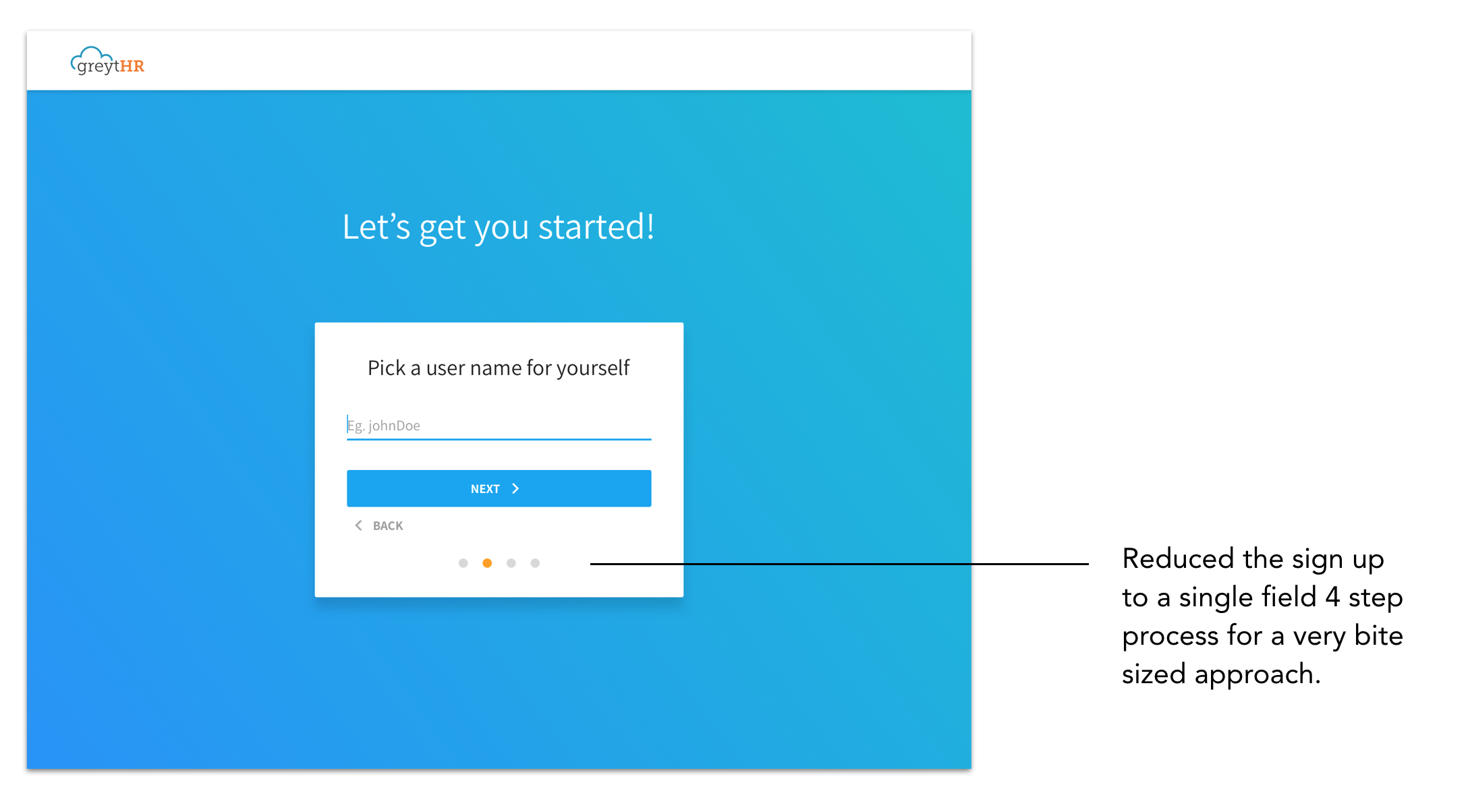
INSIGHT 4 - Sign-up form was too long for just a trial.
Customers felt like the old sign up form with 6 fields was asking for too much information for just a free trial.
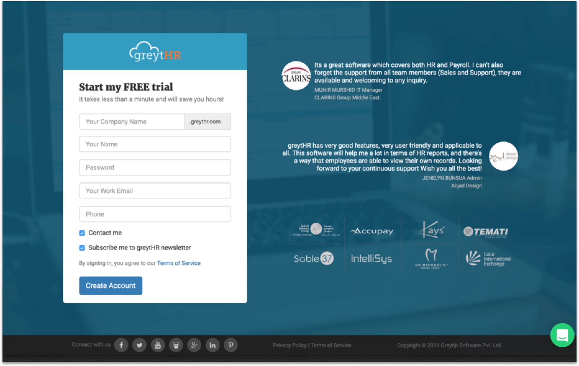
We designed a 1 field , 4 step bite-sized sign up form which made the entire process feel significantly smaller.
BIGGEST CONTRIBUTION
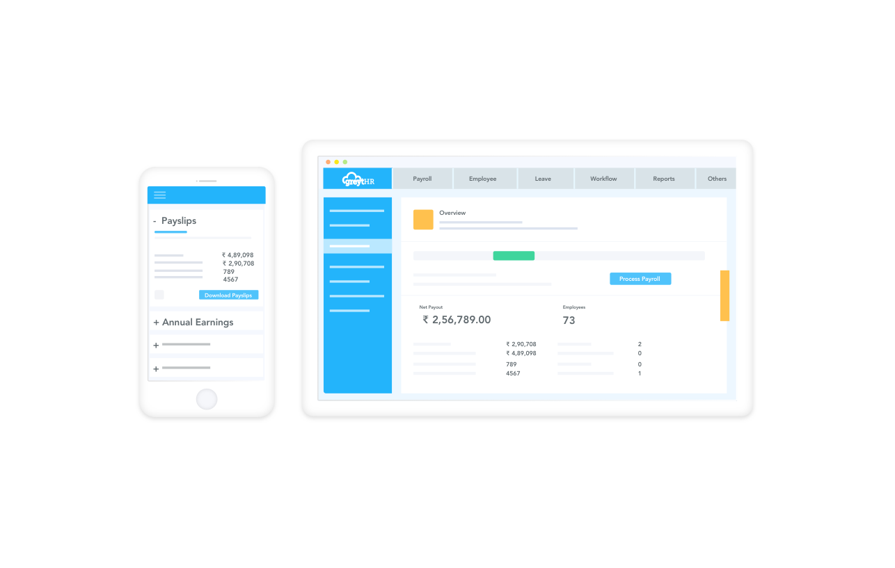
INSIGHT 5 - Screenshots of the old software were breaking the new design
It was condition from the client that they wanted the screenshots of the product to be on the website. This was a problem because at the time of website was being built, the software was not very aesthetically pleasing ( which the client agreed to) so the solution I came u with was
STylised screenshot illustrations that showed only key points
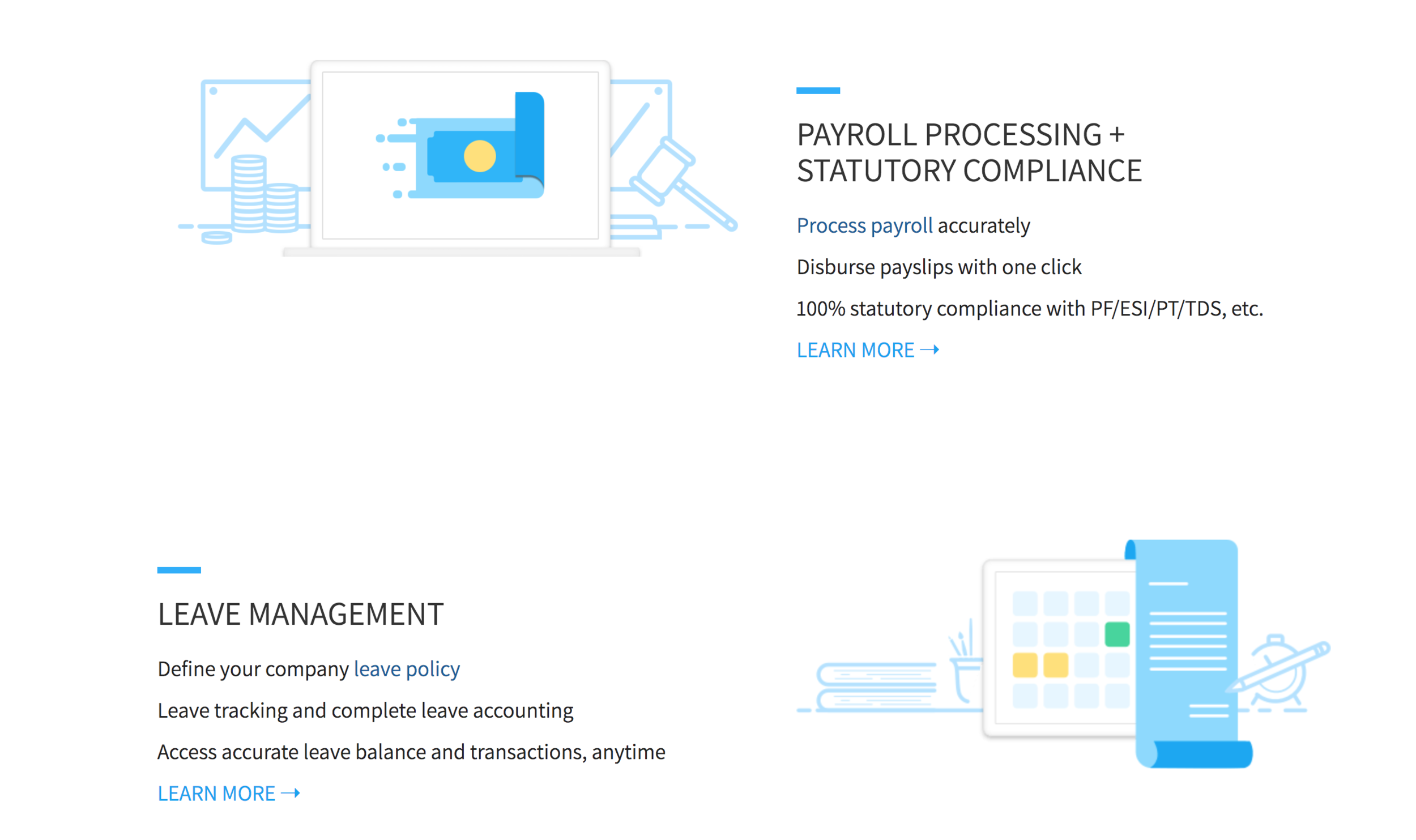
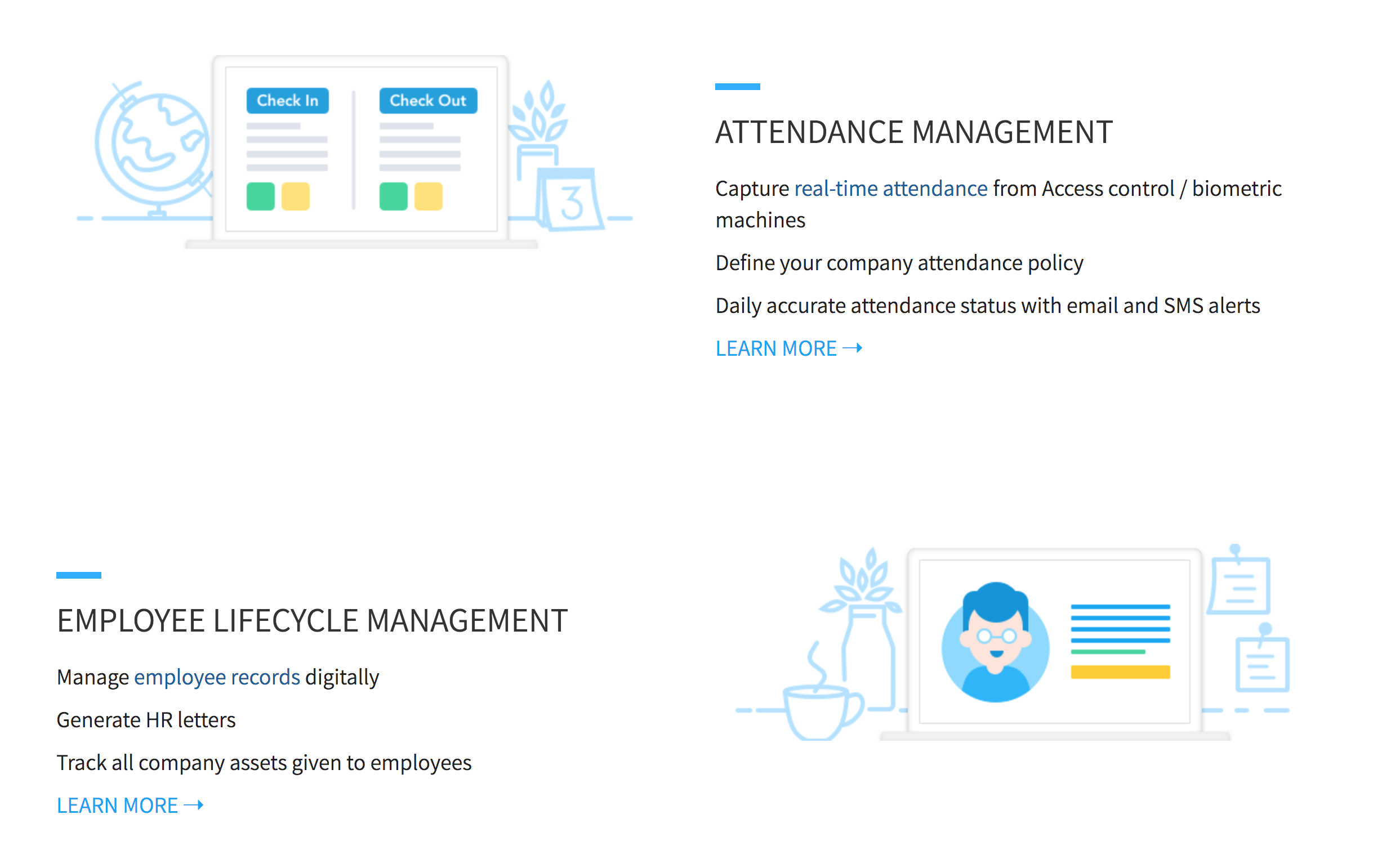
Final Features page
This is how the features page looked at the end with all the stylised illustrations
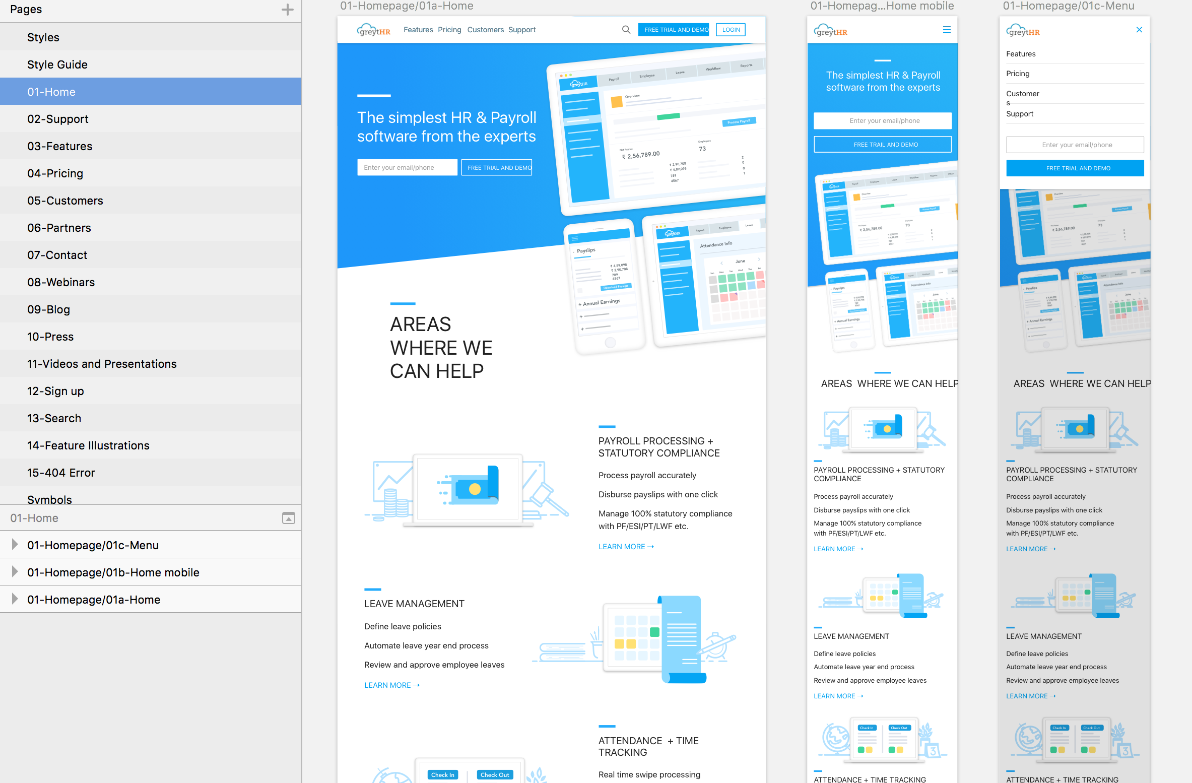
RESPONSIVE DESIGN
All the pages were designed to fully responsive
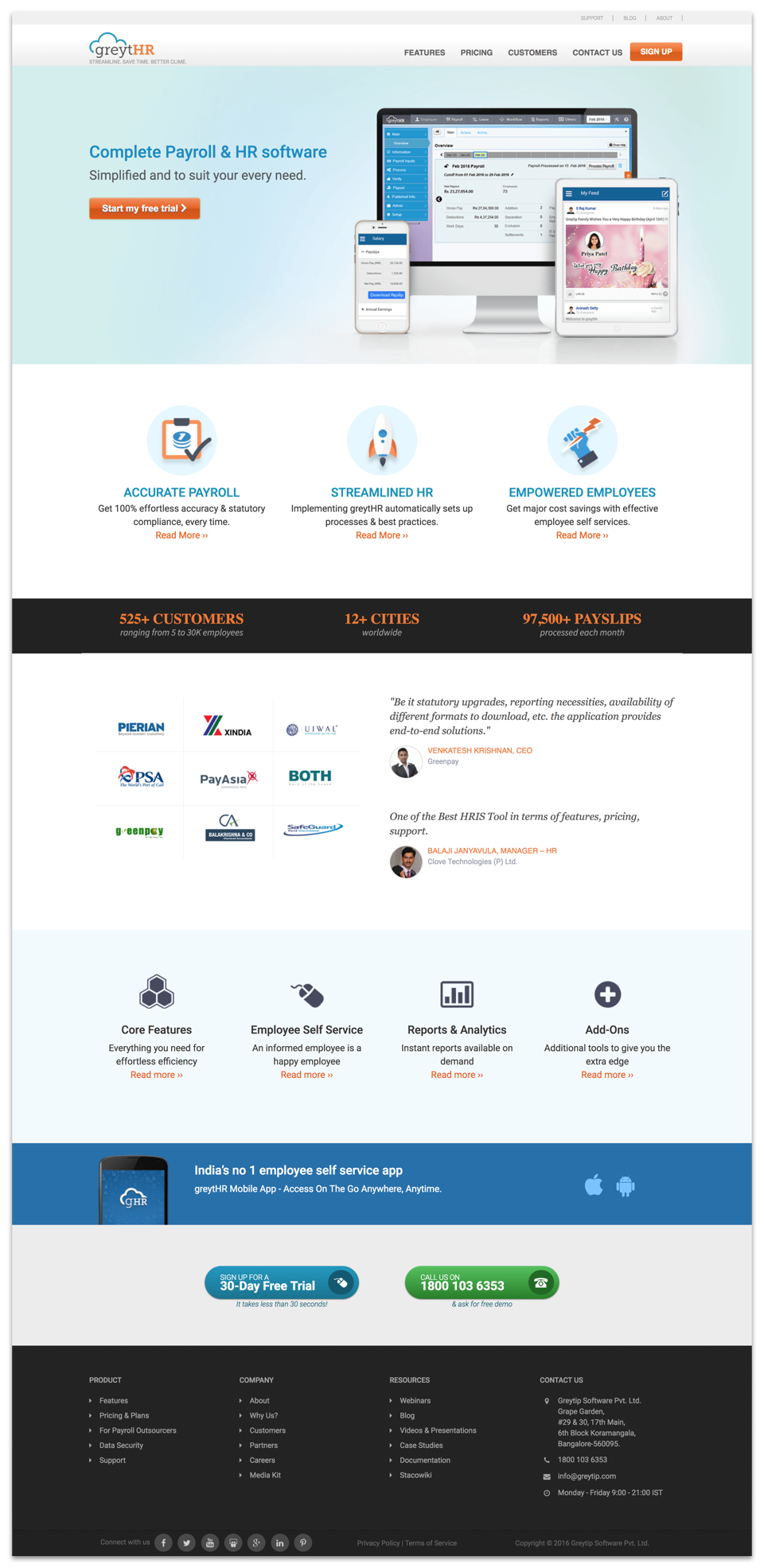
VISUAL LANGUAGE
As the visual design lead, my job was to make sure all the issues were being addressed at the UI level. Not only that,
- I set the brand language for the entire website
- Created custom illustrations and icons for the website
Live Homepage
RESULTS
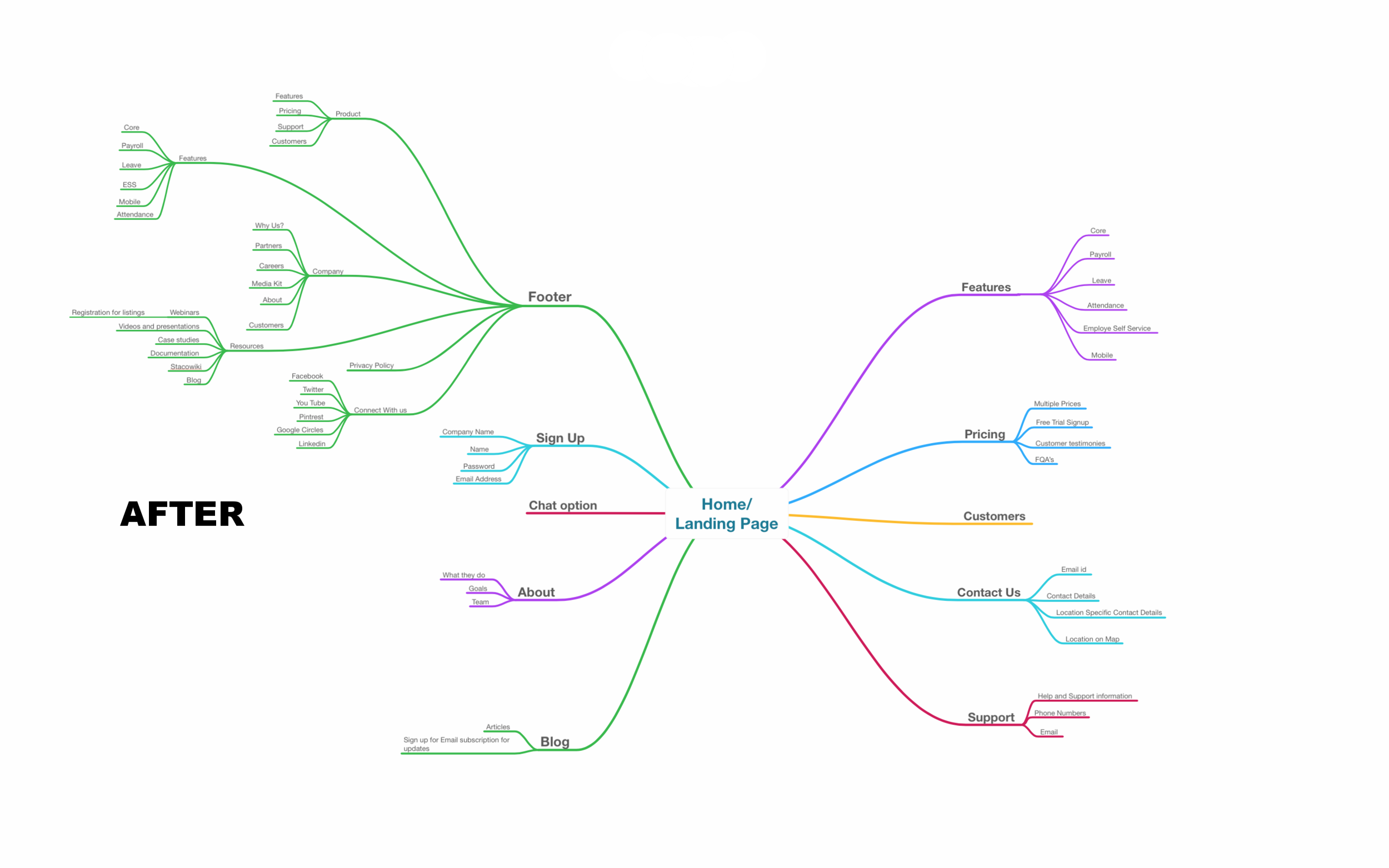
At the end of the project, not only did we tackle all the sub goals mentioned above, but our main goal of flattening the website was achieved. Click on the right arrow below to see how significantly lighter the website branching became thus making it very easy to browse.
PROJECT SUCCESS
- Shipped and developed within given deadline (4 months).
- Burden on support center by 36% lesser call rate.
- One step login led to 29% more signups for free trial.
PERSONAL GROWTH
At studio Uncommon, I grew immensely as a designer. They taught me how to not only design well but in an organised manner. I learn to create design systems ( naming conventions and art board management) and use Sketch ( text styles, symbols, brand ai etc) very efficiently. You can read about the design system followed at Uncommon
PERSONAL TAKEAWAYS
- This project was my first web design project. I order to collaborate better with developers, I took a short online course on basics of Bootstrap and HTML, CSS. Understanding of code greatly helped in the shaping of design.
- I learnt that there is always opportunity to provide engaging solutions even in traditional industries.